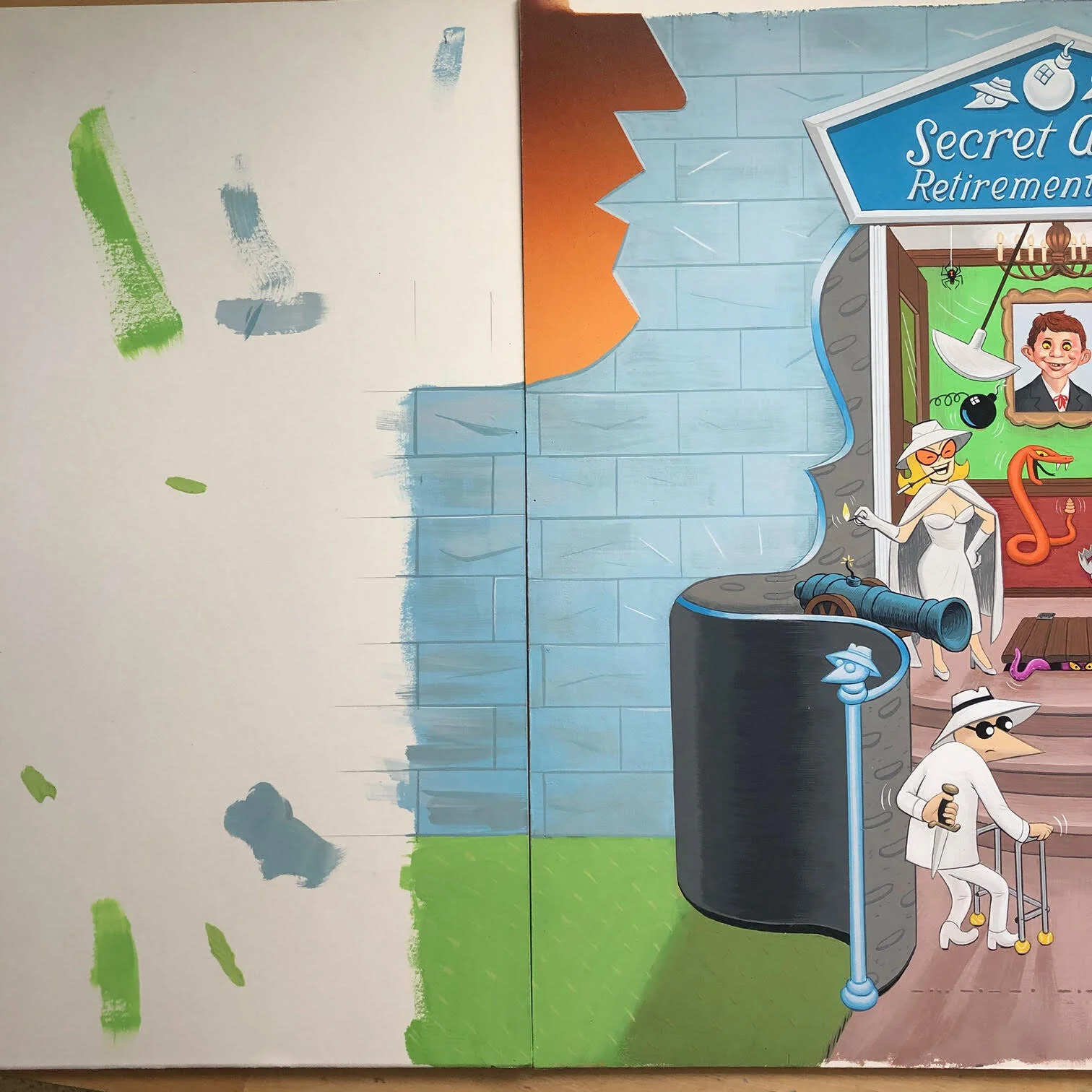
Here is a peek at the process behind Fold-In for MAD Vol.2 #18, the “Spies” issue. . This one in particular is a fond one for me, because I tried to stay true to Al Jaffee’s analog cut and paste process when he made his fold-ins.
This is the final art as seen in MAD:
Here it is folded:
I usually have to work within the given theme for each issue, and for “Spies”, the subject matter was a no-brainer– Antonio Prohias’ Spy Vs. Spy. As with any fold-in, the gag writing comes first. After a question and answer, usually accompanied by a description of the image, is approved, then it’s on to thumbnails. The question for this fold-in was: “WHEN IS A SPY NOT A SPY?”
The initial image would have the famous black and white spy on their way to a retirement home. Would they truly no longer be spies? When folded-in, it reveals a spy of another nature, one that we readily invite into our own homes. Answer: “WHEN YOU AGREE TO THEIR TERMS OF USE”
I knew what I wanted to show in the folded image, and had a vague idea of what unfolded image should contain, but now I had to actually show it.
I started with a folded piece of paper and drew a rough “Alexa”. I then unfolded it and drew a rough composition. Featured are the spies on their way to “Secret Acres” retirement home, greeted by the Grey Spy and another Prohias character featured in the strip. It’s a start!
After stewing on it for a bit, I decided the scale was off, so I made a copy of it and redrew the characters. If you look closely, you can see where a window was cut out of the central area. Also, the stylized faces on the left and right were redrawn and rearranged as well (stuck together with Scotch tape).
Rumors were swirling that this was longtime Spy Vs. Spy artist and writer Peter Kuper’s farewell appearance in MAD. The description text that MAD sent to distributors even said so:
“The secret’s out—and so are the agents! Mad #18 is our all-espionage issue, featuring Peter Kuper’s final installment of Spy vs. Spy!”
So I wanted to acknowledge this development, so I drew Peter in the secret staircase passageway, himself drawing the scene on a pad of paper.
I then printed and cut and pasted the text. Hey, this is looking like a real fold-in!
This proved a little much to Suzy Hutchinson, MAD’s Art Director/wearer-of-many-hats. She didn’t want the text to be so final, like this was the end-end of Spy Vs. Spy. I also thought that including Peter in there was a little too sentimental, it is MAD after all. So I took him out and changed the text so that it wasn’t so final.
Here we have something a little closer to the final image, but something’s off to me. I looked up the Amazon Echo on the internet and realized it is drawn too narrow. The current model is much more squat. So here is the final pencil-on-paper draft I submitted to Suzy.
From there, I scanned the drawing into Photoshop and added in a few other elements (cannon, octopus, venus fly trap).
In Photoshop on a separate layer, I traced the lines on my Wacom tablet.
Then, I did a color mock-up.
Unable to leave well-enough alone, I researched the character next to the Grey Spy on the stairs and realized that he actually worked for the White Spy side. (or Black, I can’t remember) So, to make it more equal, I took him out and put in “Tovarich”, an early character that Prohias drew while in Cuba, pre-dating Spy Vs. Spy. I was happy to see some fans catch that.
Now, the lineart was ready to be transferred to illustration board. To do that, I print the image on two sheets of 11” X 17” paper and stitch them together with tape. Then, I tape the printout to illustration board with a large sheet of carbon paper in between. Then I trace the image with a pencil to transfer it to the board. From there, I painted the piece in Holbein Acryla gouache. It measures about 17” X 17”.
Then, I did the little diagram painting that appears in the upper right corner of the fold-in and sent my files to Suzy and Bern Mendoza, the only other person on the MAD staff. Everyone was happy with it, it was a wrap.
Then, later that evening (two days before going to press), I get a message saying “URGENT Fold-In art adjustment”. It turned out, my art did not fit the fold-in template. They needed a couple of inches of bleed on either side to make it work, and rather than photoshop it, they asked me to paint patches to stitch together. Not how I wanted to spend my Friday night, but I was happy to oblige. I lined up a strip of illustration board to each side and painted bricks to match the existing art. The sunset in the background was done with airbrush, and I didn’t feel confident in my ability to replicate the gradient. So that area is cloned from the original art. Not too shabby, right?
There you have it. I am really happy with how this one came together, warts and all. Hope you are, too.
MAD-ly,
Johnny S


